Halloween is on the last day of October. People believe that dead spirits will rise again on this day, and people dress up as ghosts or monsters to enjoy the festivities. Halloween has been celebrated in areas such as Europe or America for a long time. While it is not as big as other seasons such as Christmas or Black Friday, Halloween is also another big shopping season. As many brands participate in Halloween promotions, it’s time for us to join in the fun.
For all Shakr Designer Program members who are gearing up for the fall season, we would like to share few tips on designing the period-appropriate video designs.
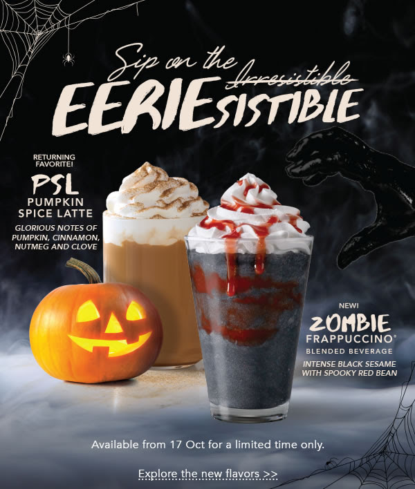
Firstly, let’s use the object that symbolizes Halloween. Of course, we mean pumpkins. Use candlelights on pumpkins to help viewers quickly associate your design to Halloween. Additionally, you can also use bats or ghosts. While Halloween is all about defeating the ghosts, it is also about enjoying the atmosphere that these ghosts form. Black and orange are recommended for the designs, as well.
These colors are recommended:
Also, think about the text to invoke the scary atmosphere. Cursive fonts in bold are highly recommended. Using white or red will put a nice contrast to the dark background.
If you are making video designs based on specific purposes in terms of events or promotions, you can just directly convey the message into the design. Use text copies like “Happy Halloween!”, then emphasize the messaging, such as discounts and additional gifts, to draw attention.
Design in square or vertical ratio to achieve maximum effect on Facebook or Instagram. Also, utilize CTA elements such as “Swipe Up”, or “Tap Next” to encourage customers’ engagements.
Example
This post is also available in: 한국어 (Korean)


